From this project I have gained valuable experience in the design processes involved in creating a piece of multimedia design. I have been able to show my creative thinking processes, with the use of mind maps, and rough designs. By working in a team I have show different communication skills (mobile phone, Facebook) and producing work together.
I gained feedback from family and friends back home as well as within my group in out of lecture meetings. I found this feedback valuable when making decisions regarding the re branding of babycham.
I feel that I could have produced more blog post up to date with the sessions, this would be a good way to improve my time keeping. Allowing me to utilise my time better.
On a whole I have enjoyed the module, with all of the main activities boosting my confidence and presentation skills. I feel that I have produced a good body of work for the assessed project which can be found on this blog and in my learning journal.
Tuesday, 10 January 2012
Poster Ideas
The last designs i have completed were Advertisment posters for the product. I had to consider the target market, product and the brand image when designing.
My logo and colour schemes had already been considered this made the design process much easier for me.
I was pleased with my designs as i felt that the reflected all of the above well. I could not choose a final design as I was unsure as to which was my favourite. But taking the project brief into consideration I do not have to make final decisions.
My favourite designs out of the ones I have drawn are the ones labelled (1) and (4) in my learning journal. These particular designs were better as they were aesthetically pleasing , when showing off the new product.
Label designs
I knew the style in which I wanted the labels for my bottles to look like. This saved me time when drawing up my ideas. On the bottle iI would use 4 labels , 3 on the front and one on the back of the bottle. The one on the back would just contain information about the product ( what it contains etc...) where as the other three on the front of the bottle would be for marketing purposes only.
The three labels would be place as follows:
The three labels would be place as follows:
- one around the neck
- one big centre oval design
- smaller rectangular design
All of which will include text, colour schemes and logos talked about in my previous blogs. All of the work is also shown in my learning journal.
Taglines
existing taglines:
Ideas for a tag line:
- Carlsberg- That calls for a carlsberg
- Fosters- He who thinks australian drinks australian
- Schloer- the adults soft drink
- WKD- have you got a WKD side?
using these existing taglines I can see how they relate the their products. I can now use this to help me come up with my own tagline for Zodiac.
Ideas for a tag line:
- Puts the stars in your eyes- referring to the name zodiac
- Let the bubbles flow- Referring to the champagne perry
- whats your star sign?
Overall I found that the best tagline from feedback gained by peers was 'let the bubbles flow' this is because it makes sense and still refers to the original product of babycham.
Colour schemes
I have already chosen the colours in relation to the star signs. However i need to consider the colour scheme for the rest of the brand.
When looking back at my research I can see that the more popular colours when designing are black and white. Both of these colours give the impression of crispness, chic, and neat.
Red is also a good colour to use when advertising as it draws the reader in because it is a warm, bold colour.
However I then considered colours that would be suited to the brands name. Zodiac is related to the stars so i looked at using various blues and shades of grey and black. I finally decided upon using a dark blue as the main colour for backgrounds. The logo would then consist of white text and logo. As they would stand out best.
The Bottle


The shape of the new zodiac bottle would need to be considered too, I preferred the slender looking alcopop bottles apposed to the bulkiness of the cider ones. As my target market was for both genders i decided that it would be better to opt for the slimmer of the two.
To add some variety to the bottle i decided to look at other bottle designs, after looking at the brands ribena and kronenbourg, i noticed that they both had embossing on the bottles. I then decided to design my own creative embossing design which would be placed on the bottles. The design can be seen in my learning journal. It consisted of a repetitive pattern of stars (logo) and the star sign symbol from the particular drink. This pattern was then trailed randomly around the glass in a spiralling sequence.


I also consider the design for the bottle top, this would consist of the star image from the brand logo.
Diversification- Fruit flavours
When creating a new style and flavour of drink i had to consider the different flavour combinations I would used. I had decided to mix all of the chosen flavours with the existing pear flavour (perry) in order to make the products more unique and to also keep a part of the old babycham products.
I had chosen to use the following fruit combinations:
I had chosen to use the following fruit combinations:
- Pineapple + pear
- Banana +pear
- Lychee + pear
- Grape + pear
- Papaya + pear
- Kiwi + pear
- Guava + pear
- Passion fruit + pear
- Cherry+ pear
- Water melon + pear
- Grapefruit + pear
- Pomegranate + pear
- original babycham
I then picked a star sign to be placed next to each name:
- Pineapple + pear = ARIES
- Banana +pear = TAURUS
- Lychee + pear = GEMINI
- Grape + pear = CANCER
- Papaya + pear = LEO
- Kiwi + pear = VIRGO
- Guava + pear = LIBRA
- Passion fruit + pear = SAGITTARIUS
- Cherry+ pear = SCORPIO
- Water melon + pear = CAPRICORN
- Grapefruit + pear = AQUARIUS
- Pomegranate + pear = PICIES
- original babycham - the original will be called ZODIAC ORIGINAL
Each of these will also have a chosen colour to represent the particular flavour, these colours are shown in my learning journal.
Logo design.
I then thought of different ways of what the logo image should be. With the use of the typeface and name I was able to draw rough sketches, considering different fruits and topics related to the zodiac. I finally decided to use for my individual bottles an individual logo which would consist of the chosen star signs symbol. But for the main brand logo i decided upon the use of stars as the image. This concept was decided upon when thinking of items relating to the zodiac.
A mock up of my chosen logo can be seen below.

A mock up of my chosen logo can be seen below.
typeface
I look at various different typefaces when considering my logo i finally decided on four that i would take into consideration these being:

From top to bottom: Lanlie be. Ballpark weiner, Baldur and Baar sophia.
I like the style of them all as they were sophisticated and crisp. However I could only choose one.
After studying the texts I finally decided upon the 3rd from bottom font (baldur). I felt that this font would be best suited to the target audience as well as being crisp and neat with slight curves to the writing.
Zodiac
The theory behind the name zodiac was that we would be able to relate brand diversification to it easily. With the use of the 12 star signs I would be able to created 12 different brand new flavours of fruit blend perry.
Each different flavour would represent a different star sign. (shown below the different star signs)

Each different flavour would represent a different star sign. (shown below the different star signs)
Name ideas
After looking at competitors me and andy then decided to mind map our thoughts when considering a brand name. We thought of different concepts and then used the internet for research into different ways in which a word can be said, as well as inspiration.
main concepts to consider:


main concepts to consider:
- animal names- beesting? birds of prey?
- lambrini- changed the name of a racing car (lambargini)
- city name- Somerset?
- random thoughts? Zeus juice - jooz
- do we completely change the whole name of babycham? or just part of it? ( opal fruits were outdated so change to starburst)
- related to the inventor- FES, shepton bubbles
We then branched out on our ideas further with the help of the internet:
Juice related words

using an online thesaurus i was able to look up different words for juice. I then considered different name ideas from this which are shown in my learning journal.
We looked at various cocktail names also with the use of a cocktail website.
Animal ideas:
- oh deer
- dark phoenix
both of them were not suitable.
With the use of zeus juice we decided to look up mythological creatures:

Finally we decided upon a name randomly - which was Zodiac.
Competitors
I collected a variety of images of various brands both from cider producers and alcopop too. The allowed me to consider the ways in which the have produced their corporate identity for their specific products.
Alcopops:


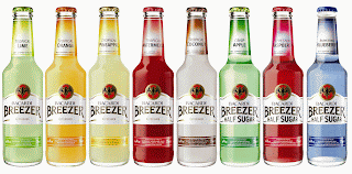


Alcopops:


all of the above are highly marketable and are at the top end of the alcopop industry, I hope that my print campaign for the new babycham would be able to run against with competitors like these brands (WKD, Smirnoff ice, Bacardi breezer and VK).
When looking at the design of these bottles i can see that all alcopop bottles are made with clear glass, this is because the colouring of the drink inside the bottles normally is a attractive, vibrant colour. Therefore by using the clear glass brands are able to show off their products.
Cider:


All of the products above are well known cider producers, they all have a good market value. As I think that the best way for the new babycham to succeed would be to make a drink that appeals to both the alcopop market and the cider market, i need to consider the design style of these cider products (magners, Bulmers, Strongbow, Koppaberg and Brothers).
The majority of cider bottles are green or brown. Unlike the alcopop colourings being attractive, the colour of cider doesnt tend to look as appealing.
Some brands of cider like Koppaberg have already produced fruity flavoured cider drinks. Therefore I thought that it would be wise to try and create a different style of drink.
The logos from both the alcopops and the ciders, are all different in style. The cider packaging tend to have the fruits included in the drink on the bottle, with fairly formal colour schemes and typefaces. The logos for the alcopops vairy completely, some are fairly boring and hold crisp clean text and edges, where as some use more interesting images (bacardi breezer logo is a bat).
This research has been particularly helpful when in the design process.
Mood board
I then created a mood board of images relating to the target market, this allowed my thought process to work better when creating my design ideas.


further research
After completing my initial research on Babychams history and background, I was then able to collect my thoughts when considering a new brand identity. I arranged to meet up with one member of my group (as the other we could not get in touch with). We decided to create a number of different mind maps ( seen in my journal) that allowed our creative thoughts to run free. By doing this we came up with a number of different ideas for a new brand image. Different things we considered were:
- who is the new target market to be aimed at? ( men, women-existing or 18yr olds)
- what type face should the new logo be?
- who are their main competitors?
- could we diversify the product?
- seasonal campaigns?
- occasions where it would be drank?
- new logo?
- new name?
- colour scheme ?
- price?
- bottle/can?
After listing a number of different ideas down we finally decided that our new brand image for the product babycham should be:
- aimed at 18-25 year olds
- be presented in glass bottles (clear)
- diversification- different fruit fusions, all unusual exotic flavours mixed with perry. (grape and pear)
- will still produce the original flavour
- will rival two competitive markets - Cider and alcopop - as we feel that with the fruit fusion and the target market it will be better suited.
- and will need a complete makeover ( logo, name, colour scheme)
Saturday, 7 January 2012
babycham initial research
We had to choose to each make a new advertising campaign for our re-branded products. We had a lit of choices to pick the way in which we wishes to advertise. The list was:
We all decided that we would just choose whichever one we felt most comfortable doing as we were not limited to choosing one each from the list. I felt that we worked well as a team in the early stages as we had made a quick decision when choosing our brand and that we have all contributed well so far.


- Print marketing campaign
- TV advertising campaign
- Radio campaign
- Promotional website
- Promotional iphone/android app
I then decided to gather some background research on Babycham and look at the different products the company has produced.
History:
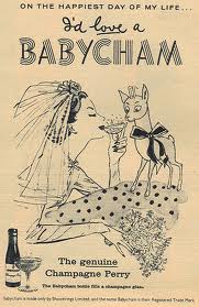
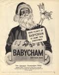
- Babychams was the first adult drink to be advertise on UK TV (1957)
- product= light sparkling perry
- launched in the UK
- 'genuine champagne perry'
- marketed at women
- Aimed as a 'romantic dinner date' or a night in with the girls (perfect way to celebrate)
- Original logo was designed and created by CDP
- Gained publicity outside the beverage industry in the 21st century - into the clothing industry + apparel featuring the fawn trademark and colourful designs.
- 1996-relaunch of the brand- fawn mascot introduced.
below are some images related to the research above:
major project :Babycham task Background research
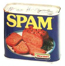
We were handed a final brief which would end up being our major project for this module. The brief was to prepare for a pitch ( pitch the re branding idea) on a product that has seen a significant decline in years. We were then given a choice of 8 brands in which we would then as a team of 4 select on of them. The brands were:
>blue nun- german wine 1950's-1980's ( easy drinking)


>blue nun- german wine 1950's-1980's ( easy drinking)
>mateus rose wine- 1950's and 1980's
>spam- canned meat
>skol larger- global beer brand
>brut aftershave
>hai karate - budget aftershave
> Babycham
>milk tray
We had to come to a group decision of which brand we would choose, and finally after looking into each of the products we decided that Babycham would be our chosen product.
Subscribe to:
Comments (Atom)