Alcopops:


all of the above are highly marketable and are at the top end of the alcopop industry, I hope that my print campaign for the new babycham would be able to run against with competitors like these brands (WKD, Smirnoff ice, Bacardi breezer and VK).
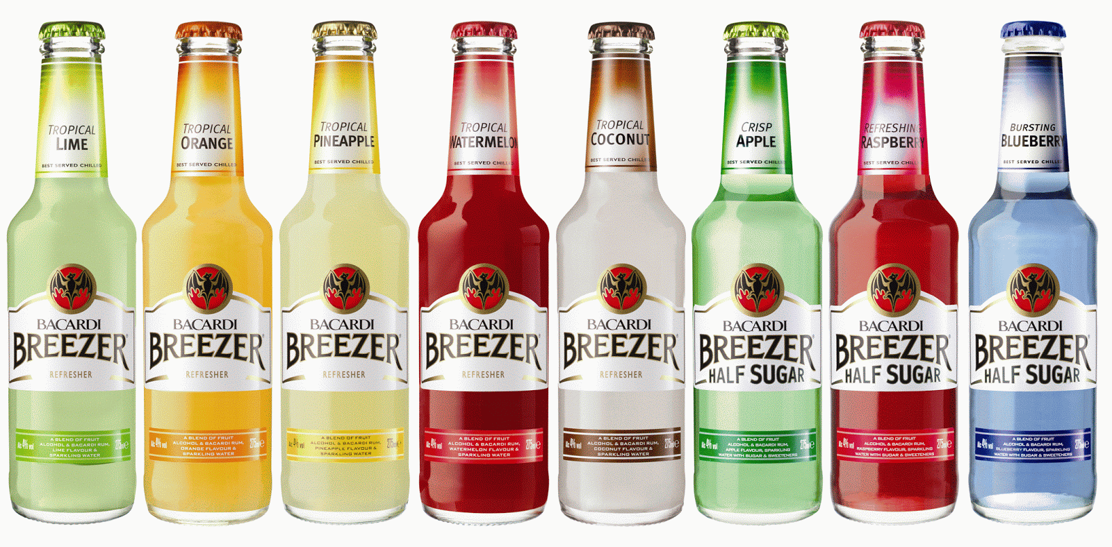
When looking at the design of these bottles i can see that all alcopop bottles are made with clear glass, this is because the colouring of the drink inside the bottles normally is a attractive, vibrant colour. Therefore by using the clear glass brands are able to show off their products.
Cider:


All of the products above are well known cider producers, they all have a good market value. As I think that the best way for the new babycham to succeed would be to make a drink that appeals to both the alcopop market and the cider market, i need to consider the design style of these cider products (magners, Bulmers, Strongbow, Koppaberg and Brothers).
The majority of cider bottles are green or brown. Unlike the alcopop colourings being attractive, the colour of cider doesnt tend to look as appealing.
Some brands of cider like Koppaberg have already produced fruity flavoured cider drinks. Therefore I thought that it would be wise to try and create a different style of drink.
The logos from both the alcopops and the ciders, are all different in style. The cider packaging tend to have the fruits included in the drink on the bottle, with fairly formal colour schemes and typefaces. The logos for the alcopops vairy completely, some are fairly boring and hold crisp clean text and edges, where as some use more interesting images (bacardi breezer logo is a bat).
This research has been particularly helpful when in the design process.
No comments:
Post a Comment